Dark mode, why is it hot and happening?

Author
Janneke van Geertruy
Published
06 April 2022
Reading time
5 minutes
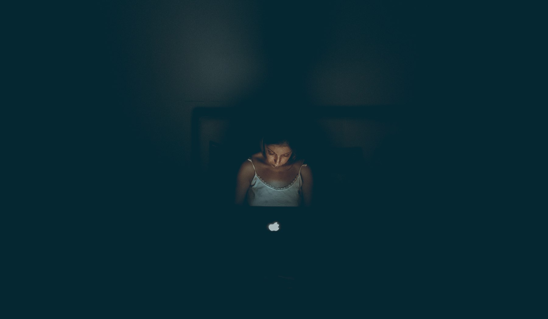
You see it more and more, websites and apps that have a light and dark appearance depending on the time of day. Well-known examples are Microsoft that implemented it in Windows 10 and Apple that launched a choice option between a light and dark interface in MacOS Mojave.
Dark mode is the term used in UI and UX design to indicate that, instead of light shades, dark shades are used when designing an interface. How and why you can use dark mode, we will come back to that. But what is dark mode really and why is it so hot and happening right now?
What is dark mode really?
Dark mode is the name for UI design that uses black and grey backgrounds instead of light ones. Dark mode is not new, the first word processing computers also used a dark background. You remember them: the computers with a black screen with green or white texts. Dark fashion therefore seems, in part, to be a 'retro' style element. Nowadays, many (mobile) devices have a screen that uses OLED or QLED. These screens can control individual pixels, which makes it a lot more energy efficient to use black backgrounds. After all, a black pixel is off and then does not consume power, which is good for the battery life of your phone. For Apple and Google, this will have been a good argument for introducing dark mode on iOS, MacOS and Android.
Hot and happening?
The most common argument for dark mode is eye comfort. It is of course nice when you lie in bed with your phone in the dark at night and are not bothered by the blinding light of a light interface. Nevertheless, research shows that light texts on a dark background are less easy to read. Your eyes get tired faster when reading a lot of text on a dark background because the letters tend to fade relative to the background. Still, many people prefer to work in a dark environment with a dark interface. Apple responds to this with its settings. When it's light during the day, iOS and MacOS show a light interface, and at night, based on what time the sun goes down, a dark interface. In addition, they also give the user the option: you can disable dark mode in its entirety or only use dark mode by disabling light mode.
When do you apply dark mode?
Dark mode is hot and there is increasing demand for it within UX and UI design. But when do you apply it? And when not? There is no clear answer to this, this depends on several factors:
- What is your target audience?
- What is the intended image you want to achieve with your product, brand or service?
- What is the context of use? Is it to get information, do you want to sell something? Or is it the intention to let the user watch content as with Netflix and Videoland?
- How much value does it add to your brand and organization?
Only when you have answered these questions can you make an informed choice about whether or not to apply dark mode.
In practice, you can certainly see large companies, including tech giants such as Apple and Google, applying dark mode to both the web and their apps. In addition, they also offer guidelines for UX and UI designers designing for their platforms.
Too little research has been done outside of personal preference of users to really conclude what is better to use: light or dark mode. That is why it is always good when applying dark mode to give the user the option to turn it on or off.
The pitfalls of dark mode
When you have considered all the factors and you have concluded that dark mode is the way to go for your company, you need to get started. Then pay attention: dark mode is not just simply reversing the colors as you do in Photoshop very simply with CMD + i / control + i. There's a lot more to it. Below are some pitfalls.
- Do not use pure black or pure white. Using white text on a black background gives too high a contrast, which can cause your user's eyes to get tired faster and cause headaches. It is better to use various shades of gray for solid surfaces or dark texts on colored surfaces. Think of buttons. Tip: Google recommends #121212 as the darkest shade of gray within Material Design.

When working with grayscale, don't forget the WCAG accessibility guidelines. Do not take shades of gray that only fit together nicely, but also think carefully about your contrast as stated in guideline 1.4.3: contrast. Do not use too dark shades of gray on top of each other or too light grays. Tip: Always test your contrast ratio with a tool like Contrastchecker.
Think about the saturation of your colors! It is very tempting to use popping colors on a dark background. But don't do that: grab that popping color you want to use and turn down the saturation. This way you maintain the feeling of using your chosen color but also ensure that there is no unnecessary "pressure" on the eyes of your user.
Tip: 75% to 80% saturation of the color works very well. In addition, use semantic colors, so you only need one naming per color and you can switch between dark and light mode.

- Avoid shadows. You don't see dark shadows on a dark background. Also, don't use light shadows – in addition to looking cluttered, it also doesn't add a sense of depth to your designs. Google has a list of examples within material design that shows components and the most suitable elevation.
Tip: If you want to apply layering, do this with different shades. Every new layer that you put on top of something makes you a touch lighter compared to the background. The layering must of course match the same number of layers as in the light mode.

Make sure you keep your interface calm. Do you have a lot to tell or do you need a lot of color use? Then dark mode might not be right for you. Long texts tend to quickly become illegible on a dark surface. Do you have a cheerful app or site for children with lots of colors? Don't do dark mode ;)
Keep in mind the guidelines of the platform you are designing for, what Apple has in its guidelines for dark interfaces does not necessarily match those of Google and Microsoft.
And don't make dark mode mandatory: give the user the option to choose whether they want to be able to view your content in dark mode.
Tip: Use a switch in your app or on your site.
Do you want to get started with dark mode after reading this article? Download our little Sketch toolkit – maybe it can help you with that.
Co-authors: Mantik Mo, Timo van Wijk.